
Website Builder
Bookmark
-
Overview
Bookmark is an AI-powered website builder that enables people without any design or development knowledge to create a website for their business.
-
Challenge
Our challenge was to fix the templates for the website builder to address the concerns users had, which included saving time on global and local customizations. We also had to create two new template types.
-
Role
My role was the lead product designer, and owner for the majority of the project. I was the solo designer who communicated with the stakeholders and the development team.
-
Scope
This was an ongoing project with multiple phases, the first of which took 8 months. We were constrained by the functionality of Bookmark’s builder, and all redesigns had to take into consideration how design configurations were layered on.
-
Approach
Customer calls were conducted regularly for feedback, and we ran a usability test to observe users creating websites with our builder. We also did research to gather inspiration for different themes.
-
Results
Customers were overall satisfied with the fixes because their own websites were improved as a result. The new template types (podcasts and phone calls) were also well received because there were customers that needed to use them.
Process
Our process had to be highly flexible to conform with the constraints that we had. I spent several hours each week in conversation with our engineering team to understand the complexities and limitations of our website builder. I also gathered feedback from the stakeholders about the issues they’d like to fix as well.
Our team had a practice of regularly conducting customer calls to better understand and empathize with the problems our customers dealt with day-to-day. I ran a usability test on UserTesting.com with the current website builder to observe users creating a website on their own for the first time. Competitive analysis of other brand websites was also done to collect inspiration for the website themes a customer can choose from. With all of this feedback and data, I was then able to define the design problems we needed to solve.
This was a huge project that needed to be broken down into several phases because we needed multiple smaller initiatives to help us stay on track with the bigger picture of improving the user experience of the website builder itself. From fixing the design issues in the layouts to fixing the website builder’s toolbars and overall user experience, there were many things that had to be addressed. With the product team, we planned for all the phases in which everything was to be implemented. This case study is only focused on the first phase of the project.
Key Insights from User Research
Customer Calls
The first type of research our team was regularly conducting were customer calls. We were very interested in learning more about the customers’ daily habits, how they use our product, and what they’re having trouble with.
This is a selection of quotes from the customer calls:
What drew you to our product?
“Wordpress dominates the internet, but it has a lot of plugins, needs PHP or other programming. It takes a long time for beginners to use plugins…”
When evaluating our product vs. other website builders, what were you looking for?
“The templates are easier to work with… It looks like the AI is choosing the layout rather than using an out-of-the-box solution. I want a modern looking website, and these templates [are] ahead of their time.”
Usability Testing
Next, I ran a usability test on UserTesting.com to observe people using our website builder to create a website for the first time. This is a selection of quotes from different user testers:
"I'm kind of upset that this doesn't automatically format my number."
"I wasn't sure what to expect. I wasn't sure if it was something I could change later."
"I'd like off the bat to be able to upload my own photos."
"It's kind of teaching me how to do things, like if I wanted to go back and change things. Feels very professional, and unique."
Competitive Analysis
Competitive analysis of other websites was also done to collect inspiration for different website themes. In the website builder, you can choose a theme for your website’s brand before the rest of the website is generated for you. Depending on which theme was chosen (ex: bold, modern, playful or elegant), the layout templates will look different for your website.
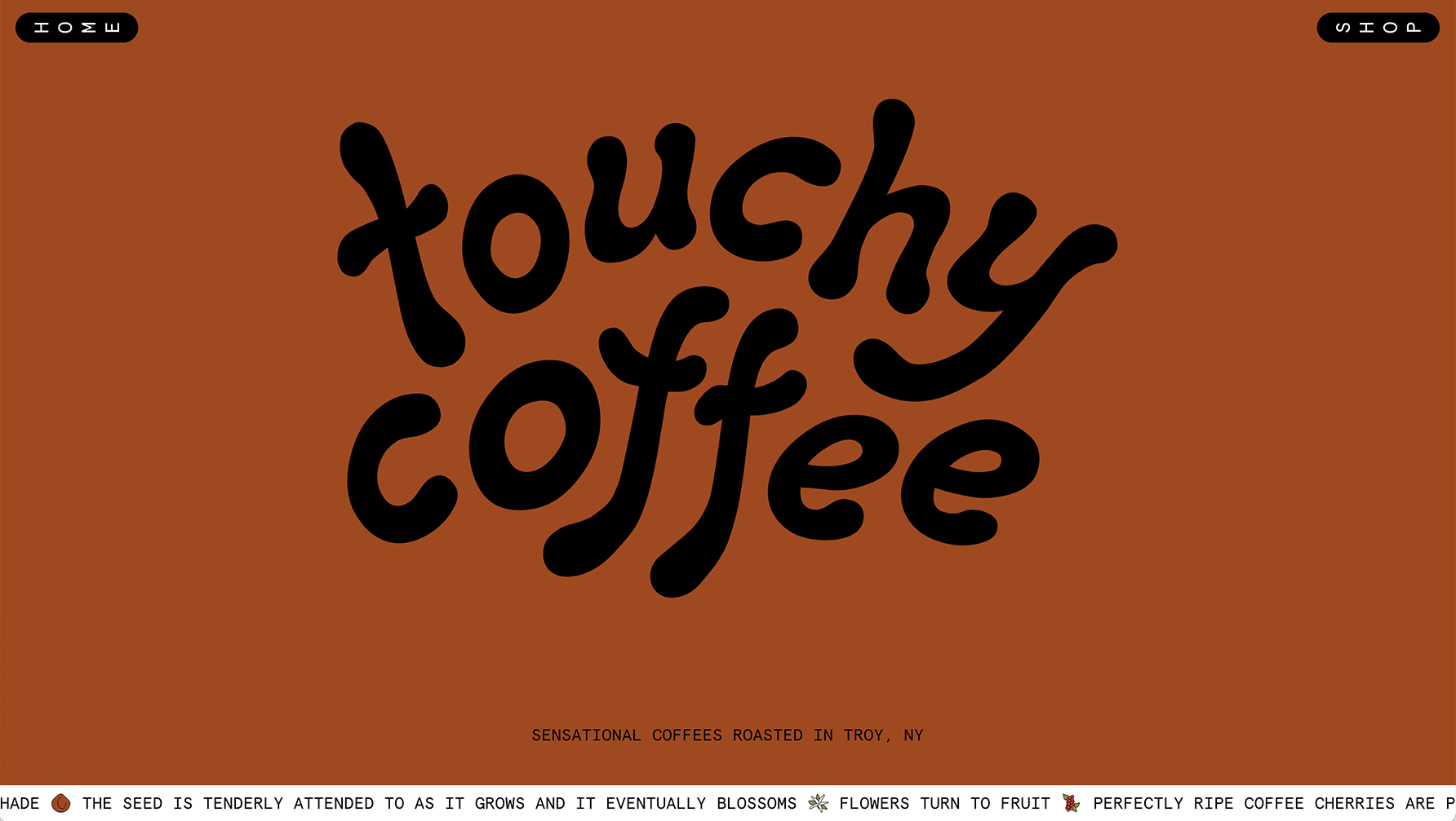
"Touchy Coffee" website
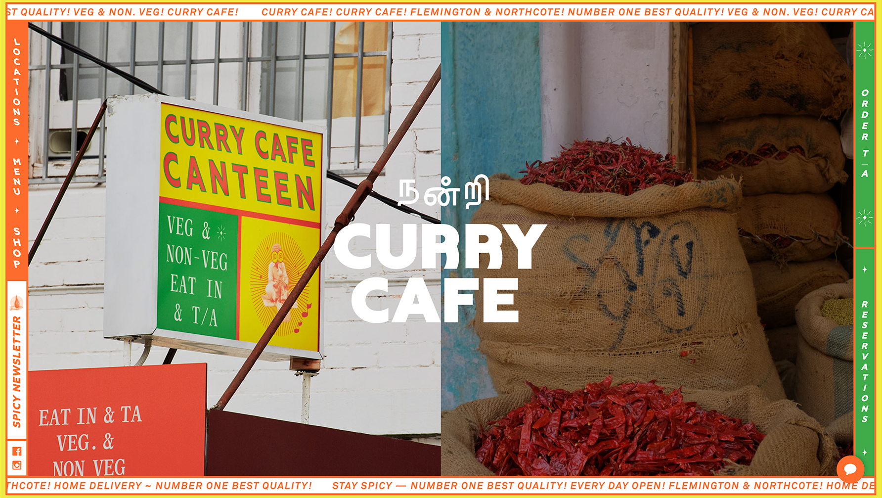
"Curry Cafe" website
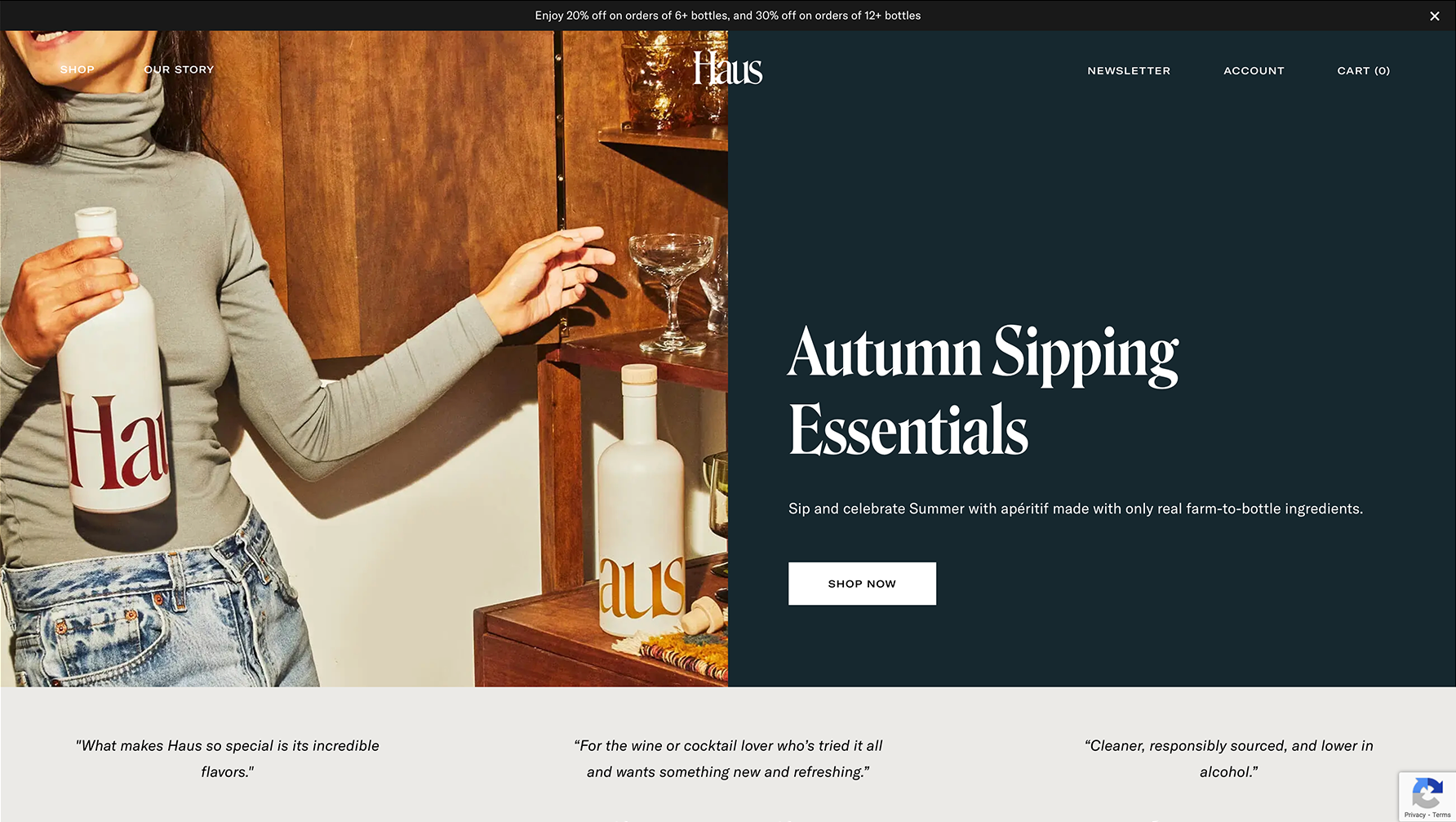
"Haus" website
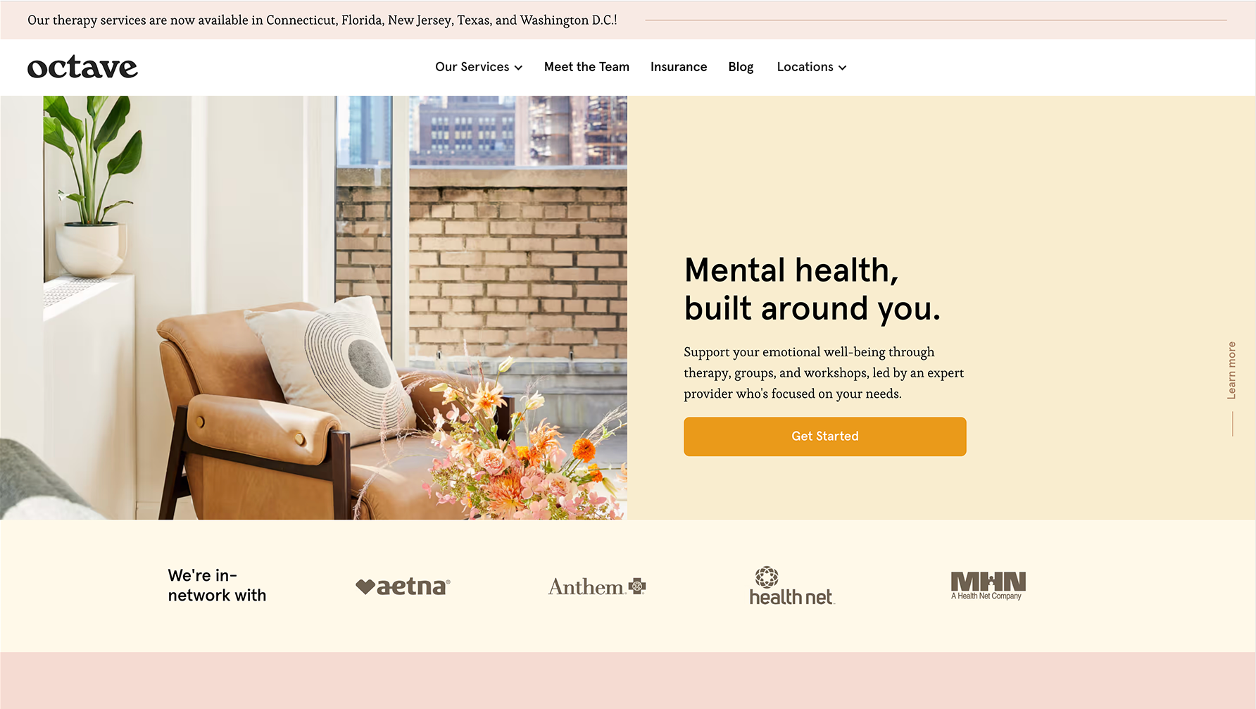
"Octave" website
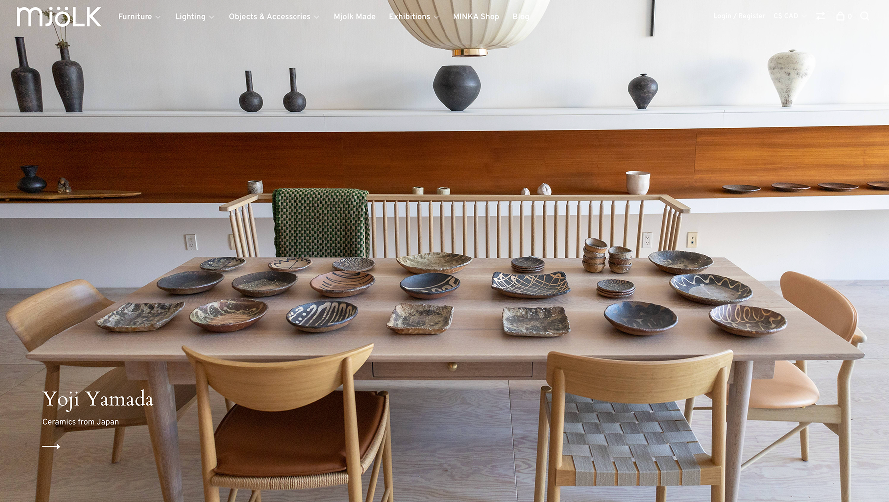
"Mjölk" website
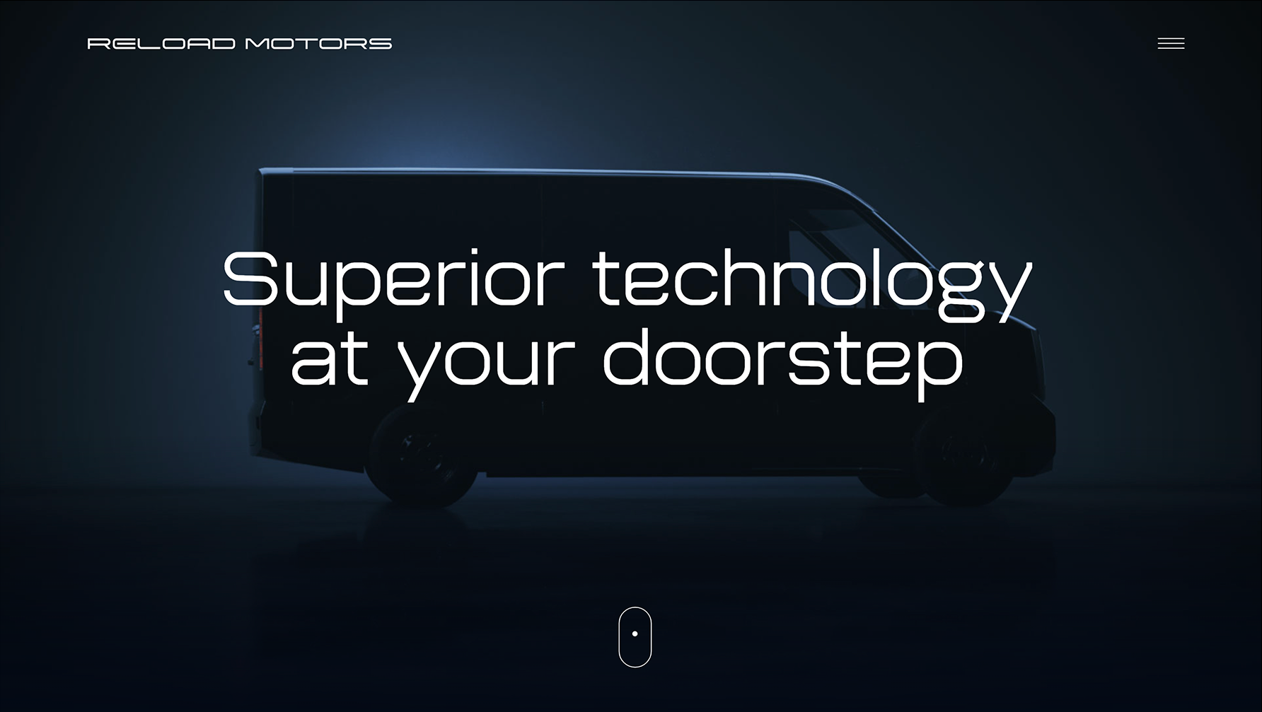
"Reload Motors" website
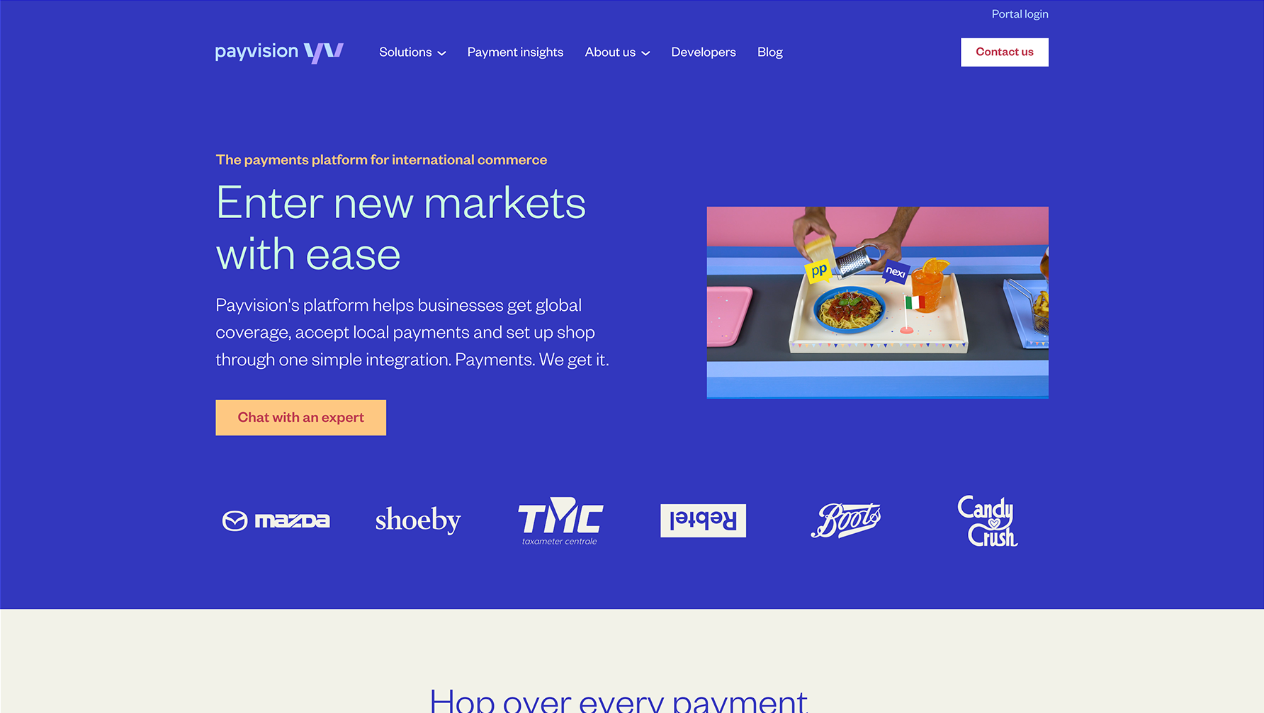
"Payvision" website
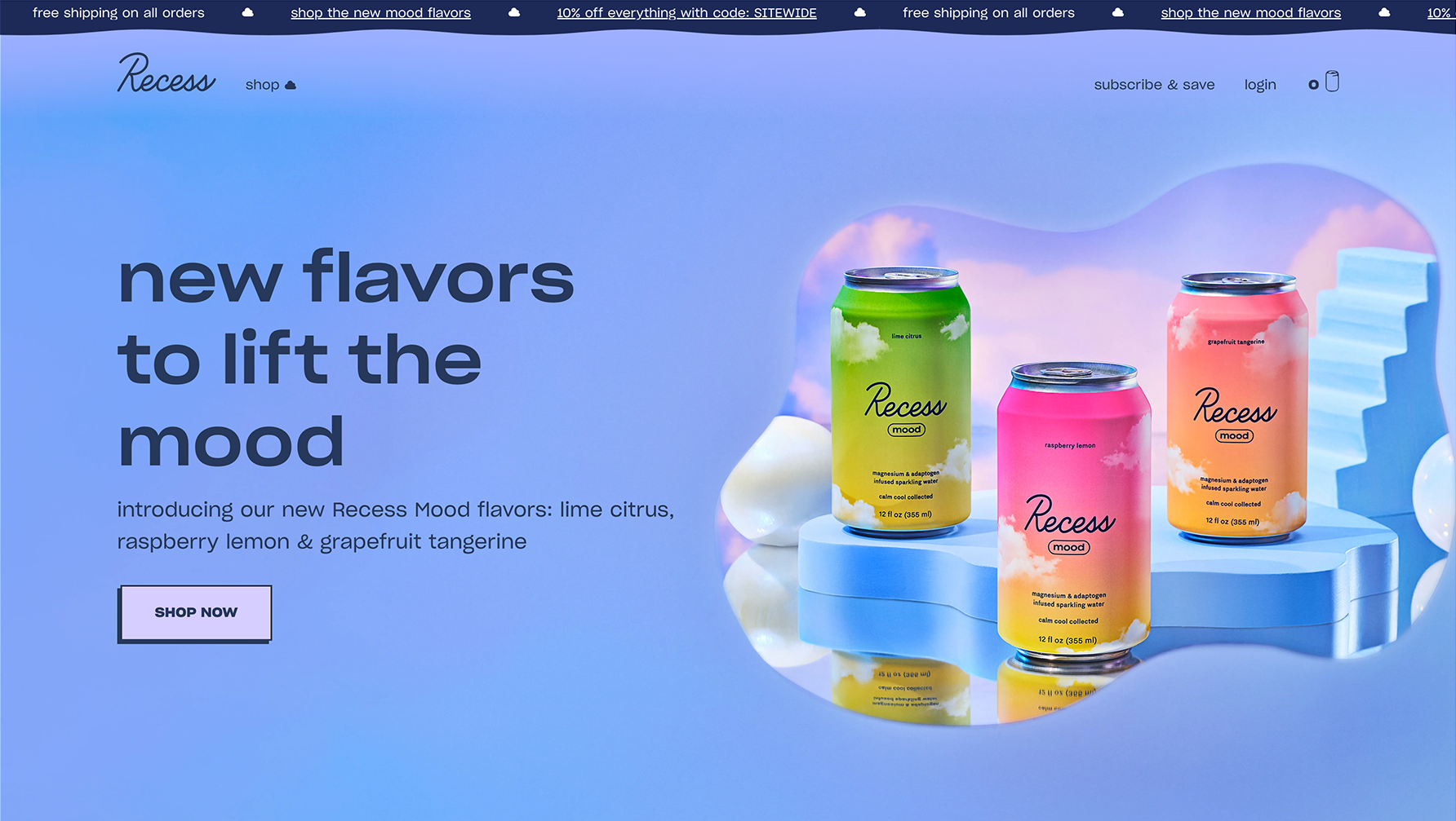
"Recess" website
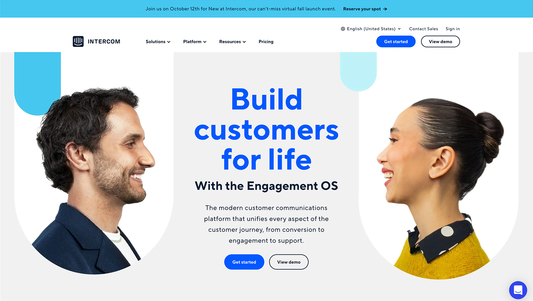
"Intercom" website
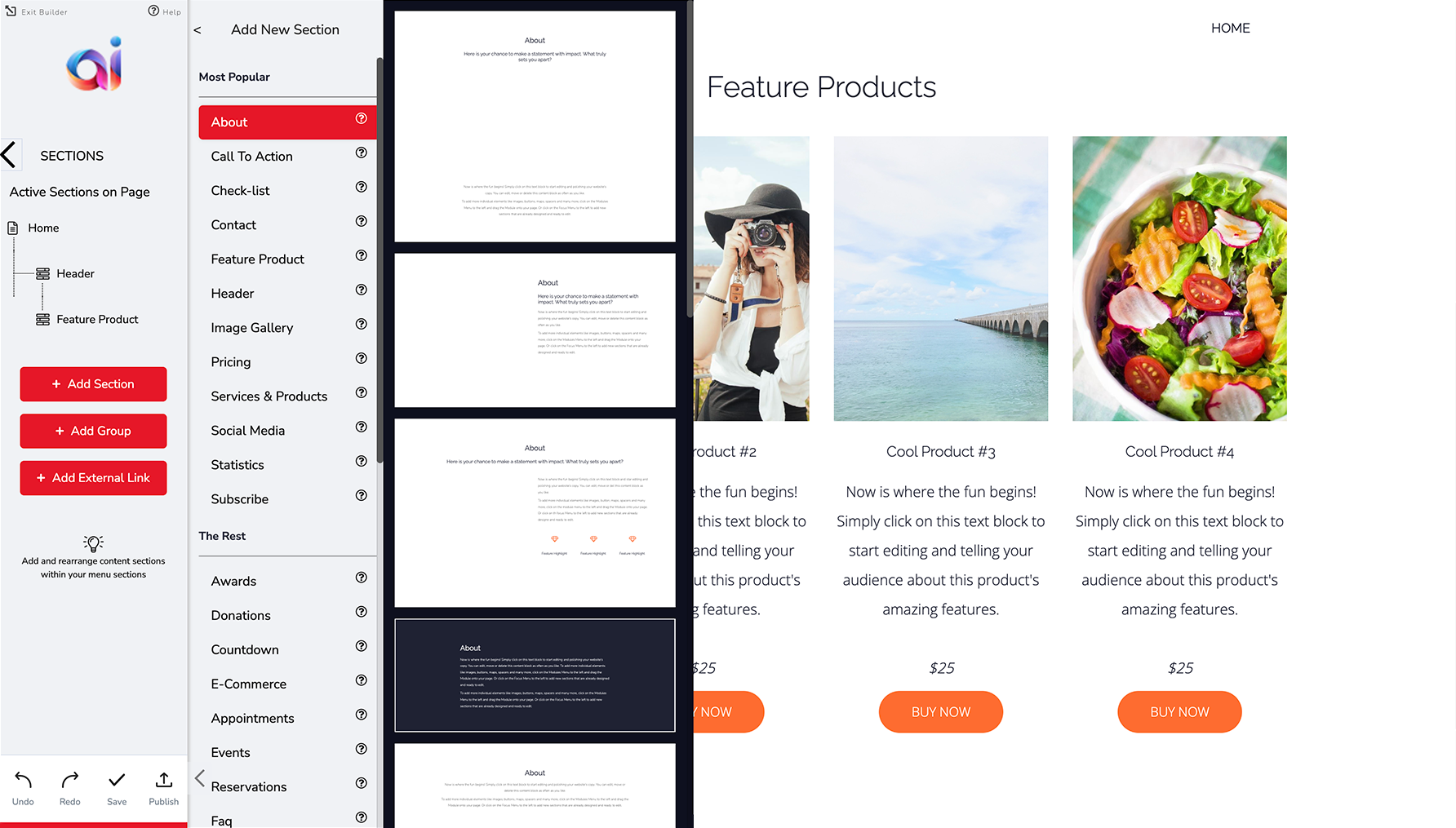
Design Iterations
Taking into account all the feedback and research that was collected, I started on the redesign of the website templates. There were 38 different section types, each with 7 to 12 variations. Two new types were also created with their own variations. I worked concurrently with the stakeholders and engineering team to ensure that all the changes were effective, and achievable.
These were some of the design considerations that I made:
Introduce the ability to make global changes to the websites, as well as keeping the customized changes that are local.
Include many versions of a template so that there’s always something that suits their business’ needs.
Improve the user experience of the templates by addressing these issues:
Lack of hierarchy in the layouts
Confusing mix of typography with poor choices for font pairings, weights, sizes and colours
Elements that aren’t aligned with one another
Poor button interaction design
Bad spacing between elements
Use a phased approach to the changes so that customers aren’t alarmed by potential changes to their front-facing websites.
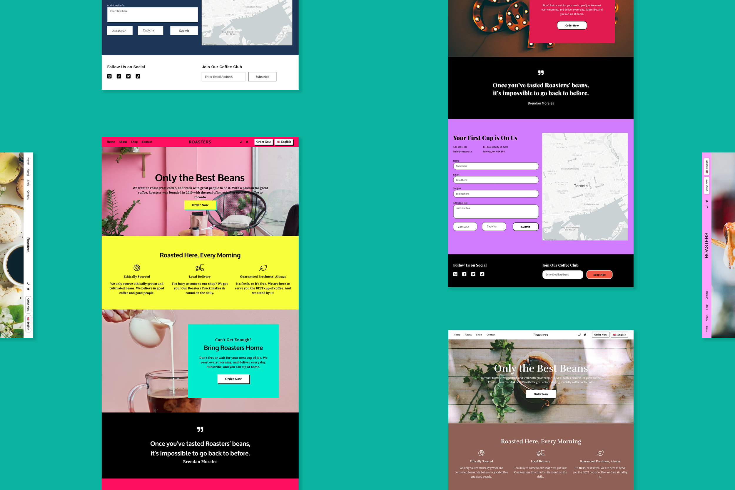
Checklist Templates
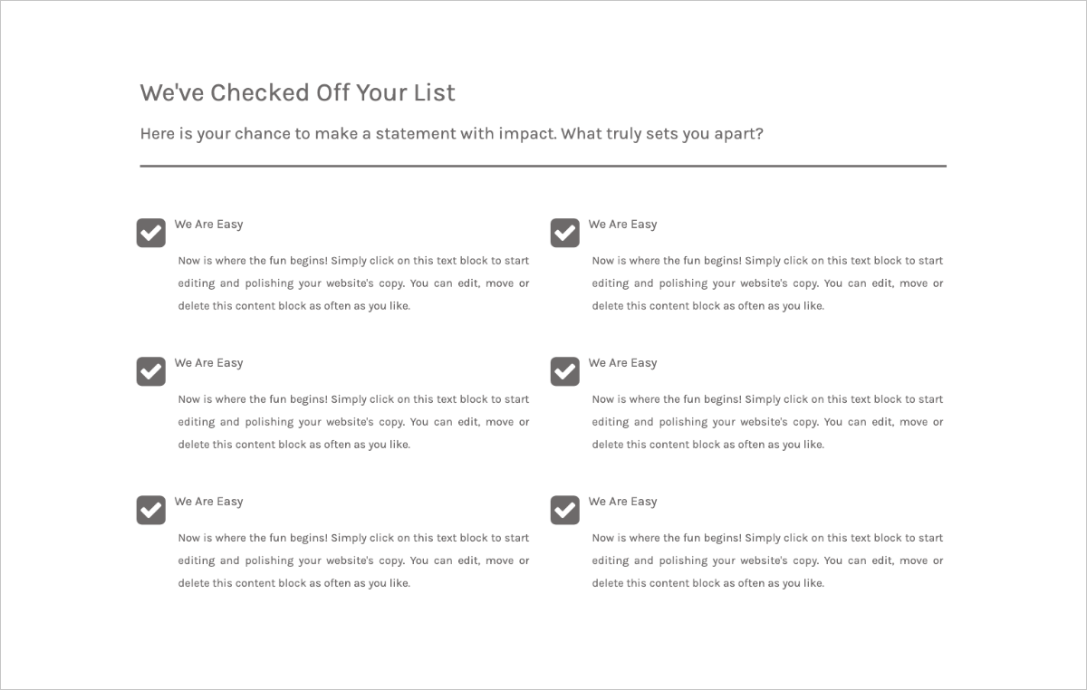
Original design of checklist template
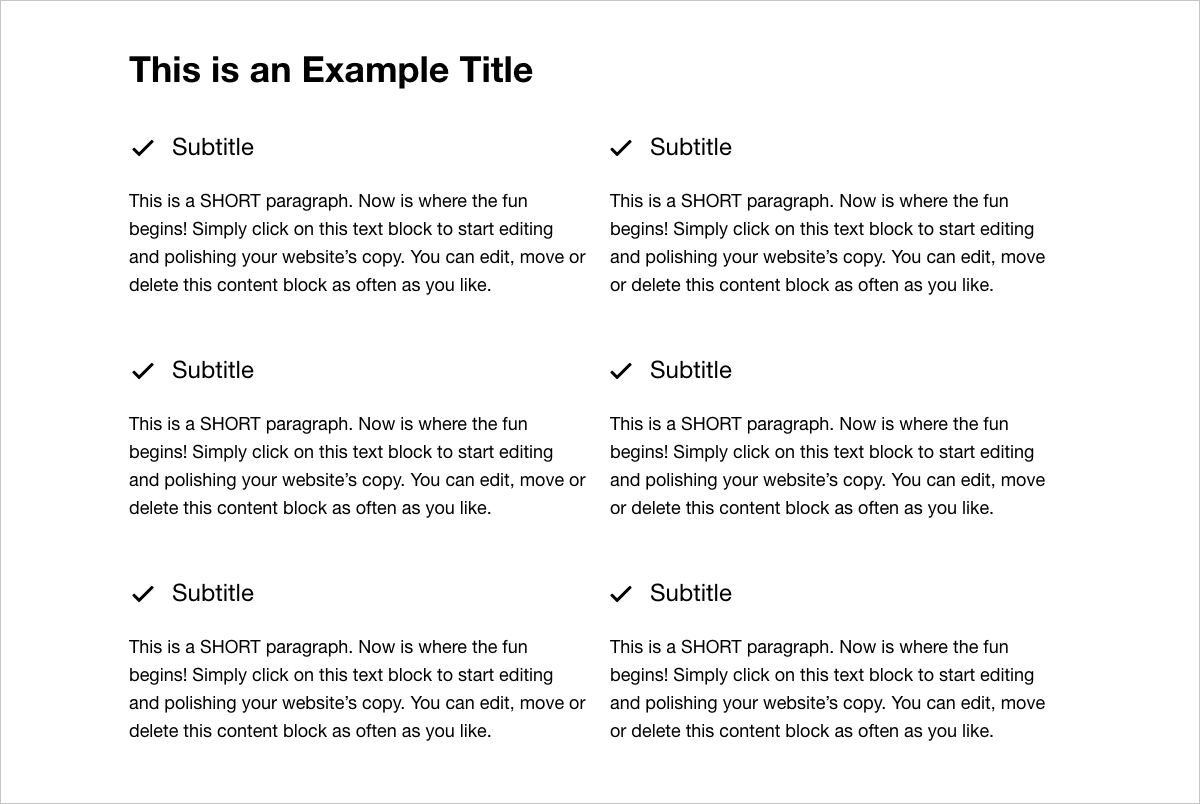
Redesigned checklist template
Countdown Templates
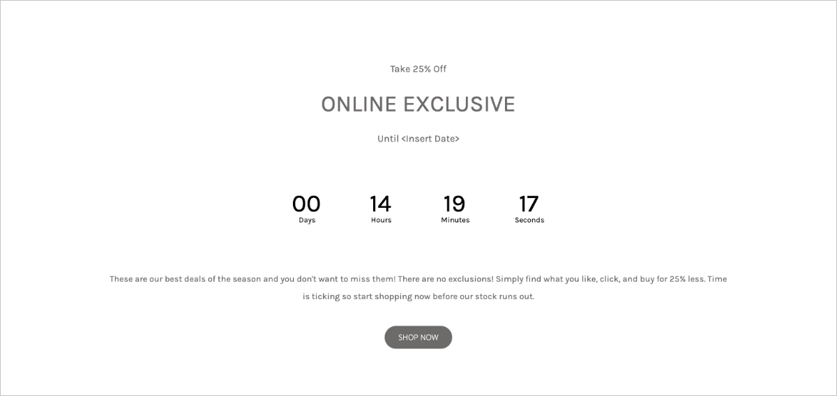
Original design of countdown template
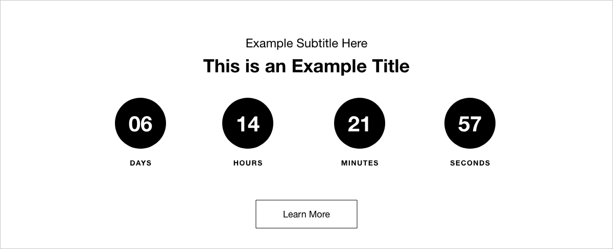
Redesigned countdown template
Menu Templates
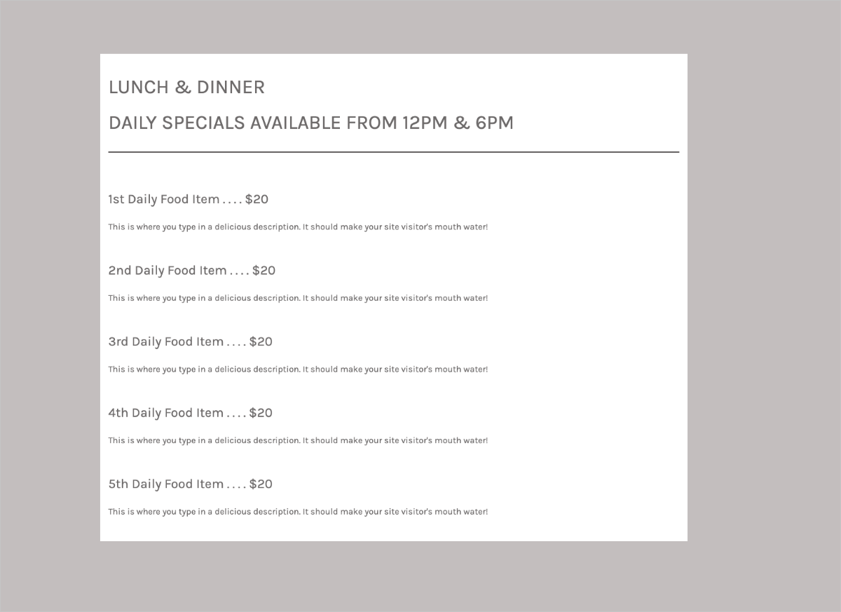
Original design of food menu template
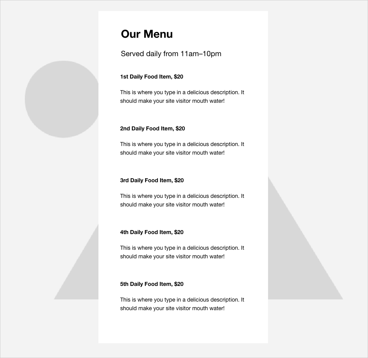
Redesigned food menu template
Statistics Templates
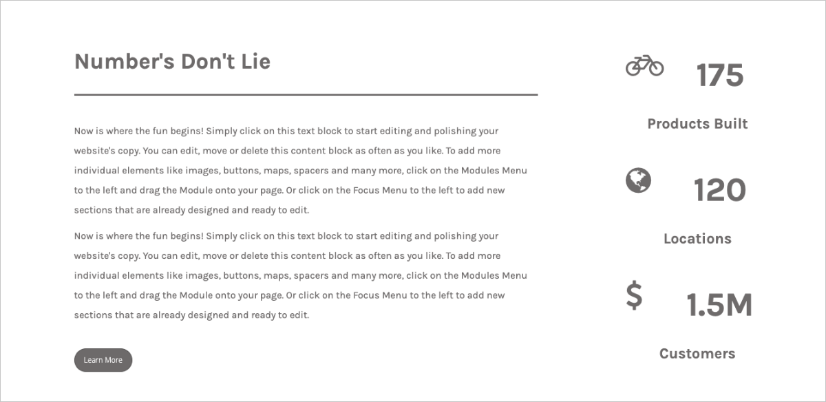
Original design of statistics template
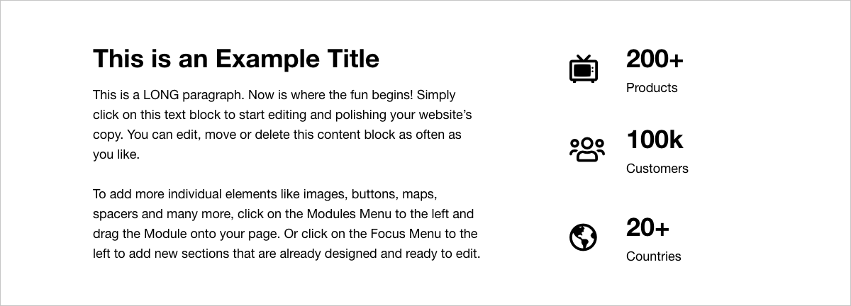
Redesigned statistics template
Theme Kits
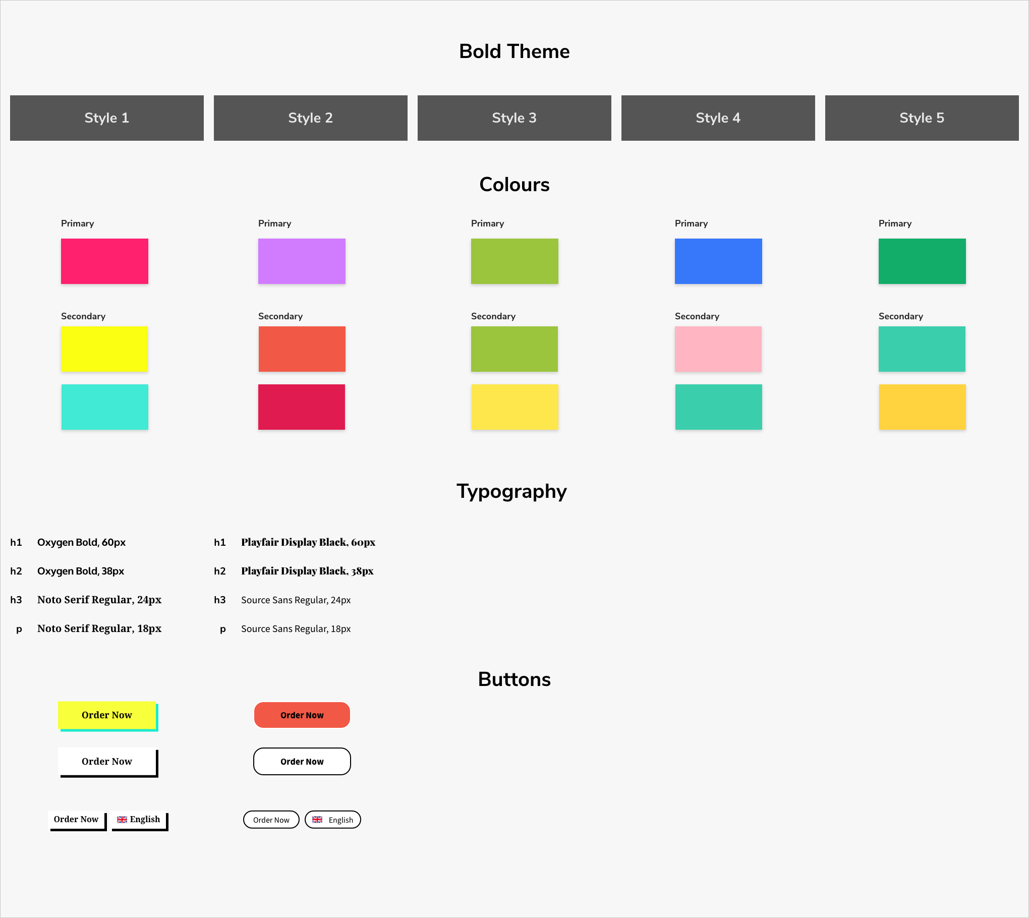
Visual style sheet of the bold theme
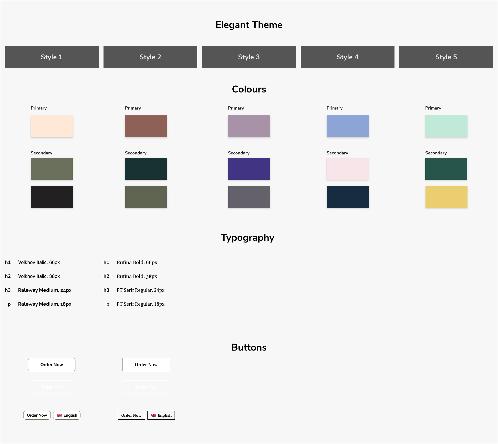
Visual style sheet of the elegant theme
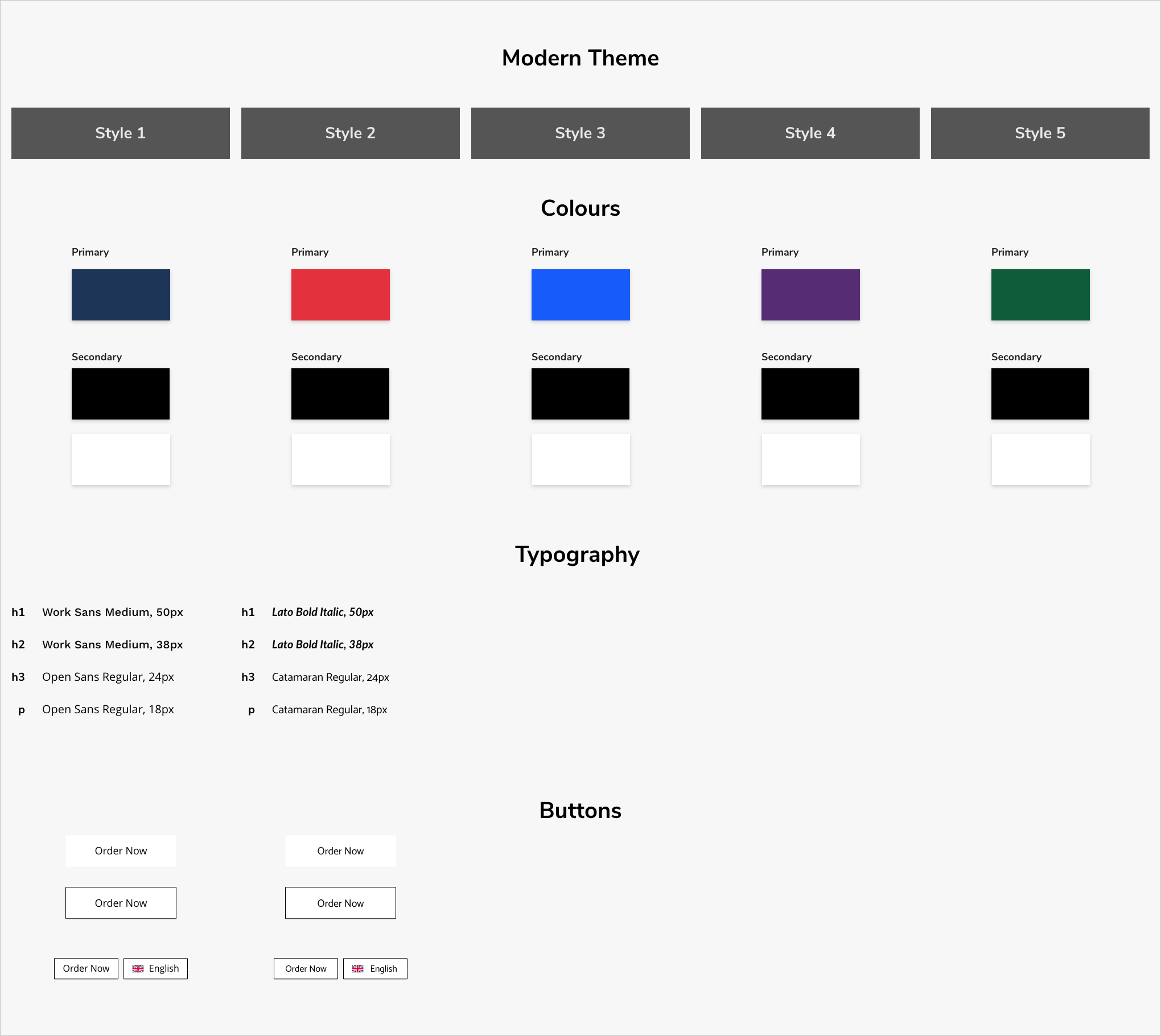
Visual style sheet of the modern theme
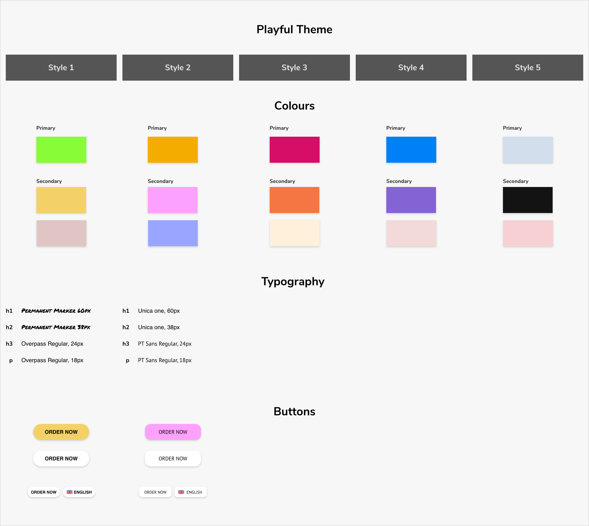
Visual style sheet of the playful theme
Results
Customers were overall satisfied with changes because they also saw an improvement to their own websites’ conversion rates. The stakeholders were also happy because the framework for how the project was planned out meant that the engineering team could ship product updates faster. They were also happy with the completion of the first phase of the project, knowing that it will move ahead smoothly into the next phase.
Looking back on everything now, our process could have improved if we continued to conduct usability tests, in particular after the redesigns of the website templates were done. It would’ve been useful to see if the changes were effective. Other research methodologies that could have been helpful are: task analysis for observing what tasks customers want to perform, and customer journey mapping to have a storyline of all customer touchpoints.