
E-Commerce Templates
Bookmark
-
Overview
Bookmark is an AI-powered website builder that enables people without any design or development knowledge to create a website for their business. The global e-commerce market is expected to be at $5.55 trillion by 2022, so it’s imperative to have an e-commerce platform.
-
Challenge
Many of Bookmark’s users will choose to have an online store instead of the more traditional website. To help us get to market quicker, we decided to use an open-source e-commerce framework of which the entire front-end system and UX was entirely customizable.
-
Role
My role was the lead product designer, and manager for the majority of the project. I was the solo designer who communicated with the stakeholders and the development team.
-
Scope
The scope of this project was to design all of the foundational elements and modules that comprise a modern e-commerce store. Using a “building block” approach, these elements would be snapped together using Bookmark’s website builder to help store owners realize their sites. The initial MVP took two months.
-
Constraints
The biggest constraint was the open-source e-commerce framework we needed to use. It’s difficult to reskin the existing modules to look on-brand, and there are limitations to the new functionality we could build into it as well.
-
Results
Product engagement increased as more customers started selling products on their websites. Stakeholders were satisfied with advancing the goals of the business to have more e-commerce templates available.
Process
Our design process was quite fluid to manage the project constraints, and short timelines we had. I worked closely with the engineering team to understand the limitations of the system’s front-end architecture. Based on our conversations, I was able to gather a general list of pages that had to be created:
Product details page (including variations depending on the product type)
Category page with filter
Shopping cart, and check-out experience
Reviews on the product page
Customer login portal
With this outline, I proceeded to break down each of the pages into the different smaller components that had to be designed to make up a whole page.
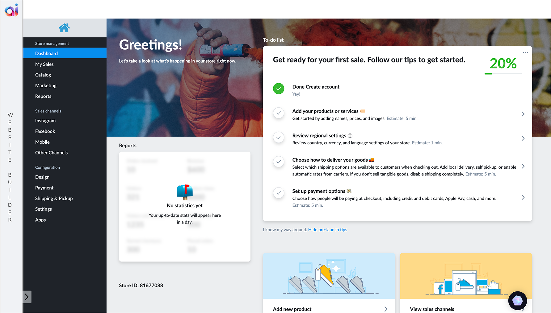
Original e-commerce tool
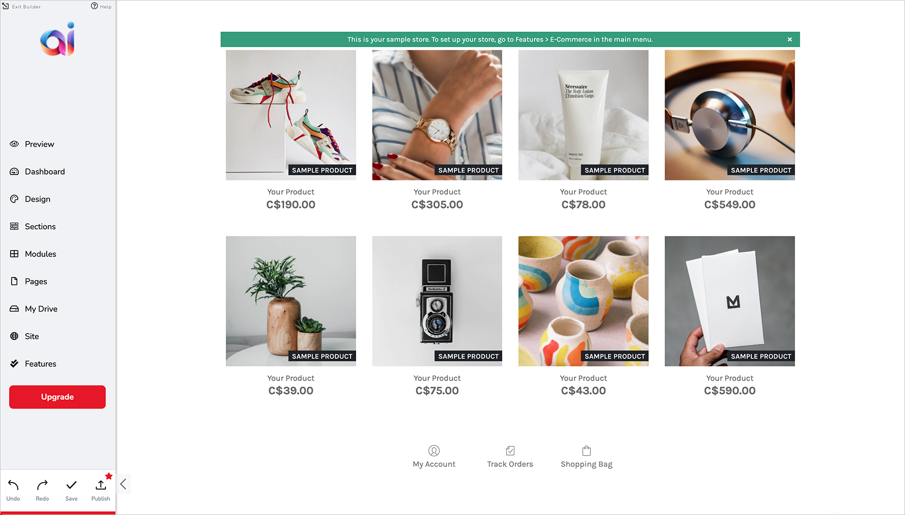
Original e-commerce store on website builder
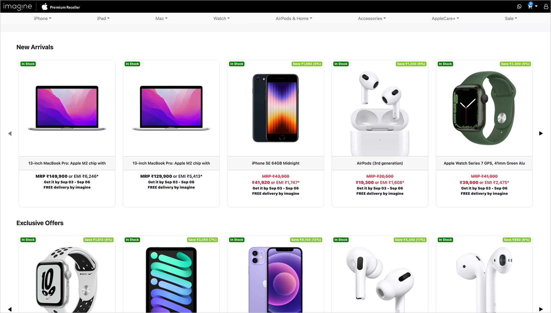
Example of online store using open-source framework
Key Insights from Research
Stakeholder interviews, and competitive analysis of other websites were the two areas of research I was able to conduct. Based on my conversations with the stakeholders, we came to these key insights to focus on:
-
Customers are busy people, and have less than 5 hours/week to work on their website.
-
Customers consider themselves design-savvy, and have distinct ideas of how to portray their brands.
-
Customers are technologically sophisticated, and have high expectations on usability, performance, and feature depth.
With these in mind, I started looking into other e-commerce websites and platforms to get an idea of what experiences they designed for their customers. Below are some learnings I gleaned from the competitive research:
Product Details Page
Display all the product details so that customers will know what colours and sizes are available, the name and description of the product, and the sale price and original price. Additional details (ie: product features, shipping and return details, product care guide, and more) may be hidden in an accordion view.Category Page
Use the same product component for all the products on the grid, and include details to show the variety of options for each product. Use a menu to show category filters, and have relevant products be displayed automatically.Shopping Cart
Many shopping carts appear as slide-in screens on the right side of the page, or as a dropdown from the top navigation bar. Show a countdown to free shipping if there’s a minimum subtotal to reach.
Check-Out
Show a progress bar so that the customer knows how many steps there are, and what step they’re on. Consider having auto-fill available when entering names, addresses, phone numbers, and emails. Coupon codes should have a built-in verification system to check if a code is valid, and to how much of a discount will be given.
Customer Reviews
Reviews are usually shown in the bottom half of a product details page, but are sometimes summarized in the additional details section. Display and bring attention to the overall average rating of the product. Show the most helpful reviews first, if there’s already a way for customers to vote on reviews. If not, show the reviews in order of top to worst ratings.
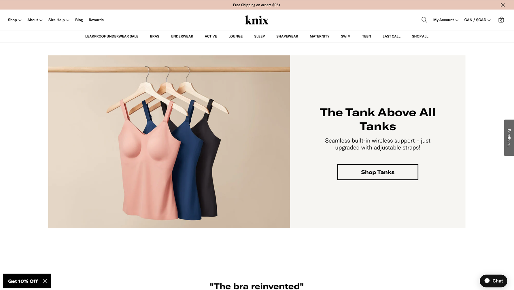
"KNIX" website
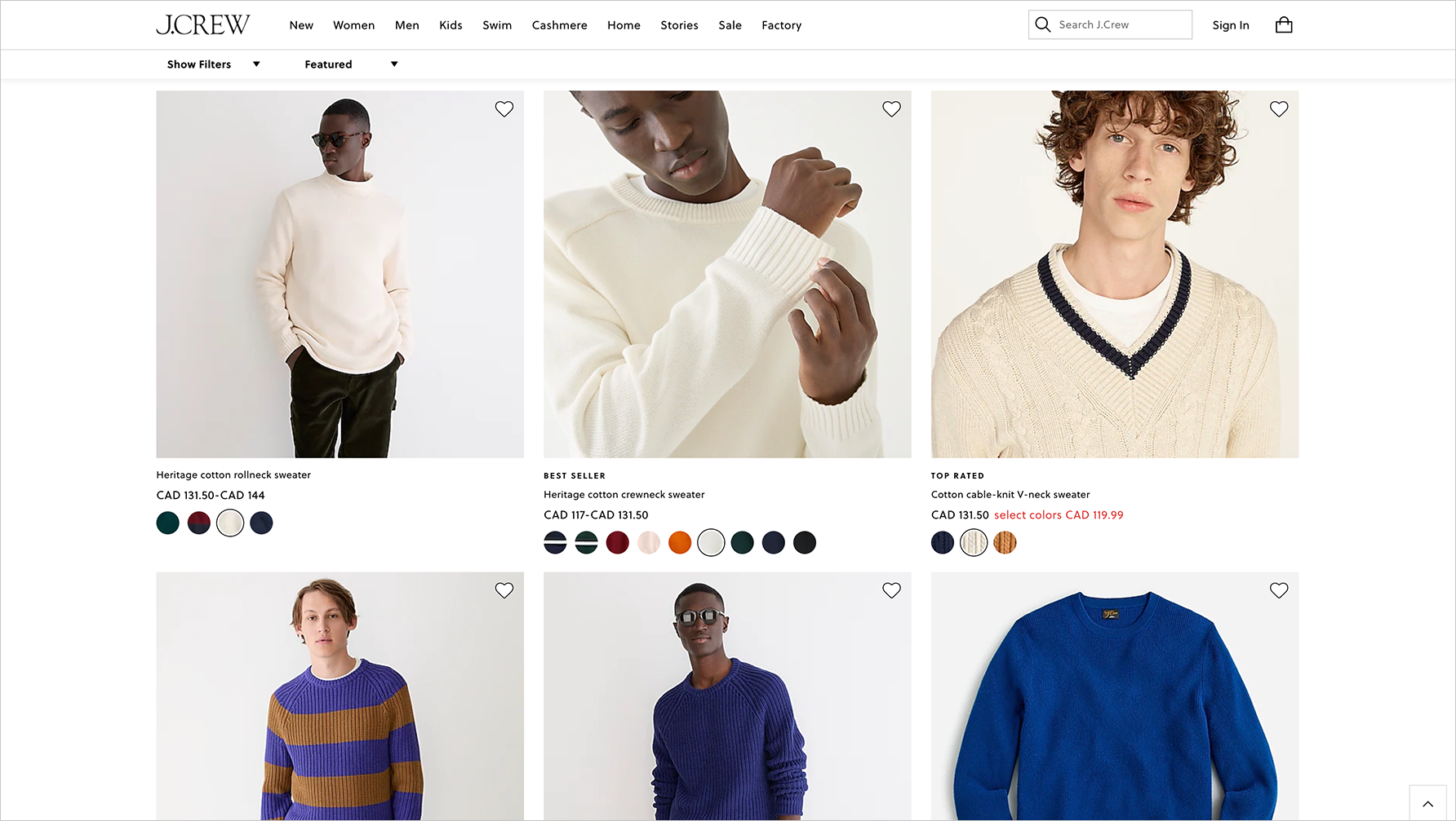
"J.Crew" website
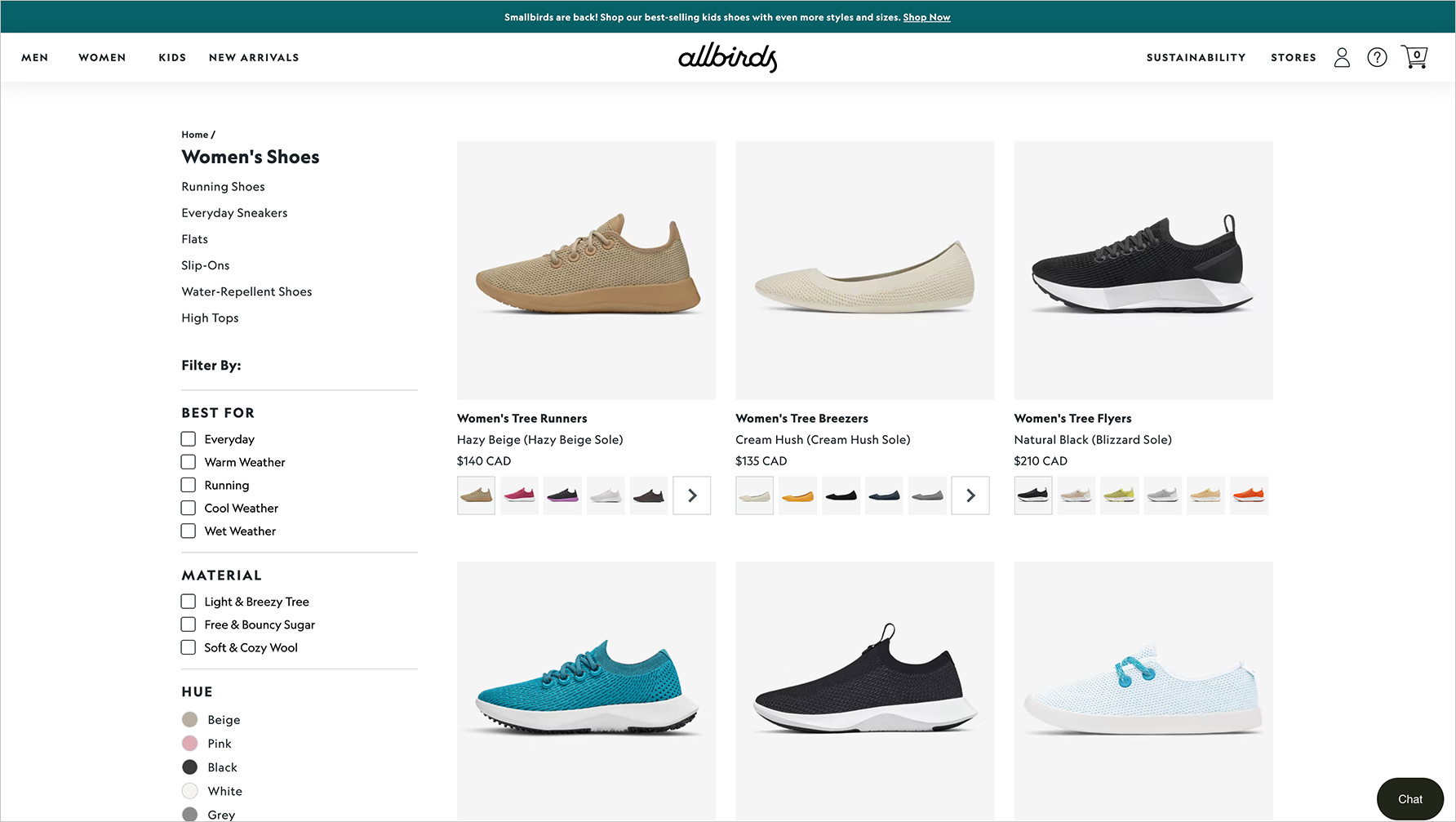
"Allbirds" website
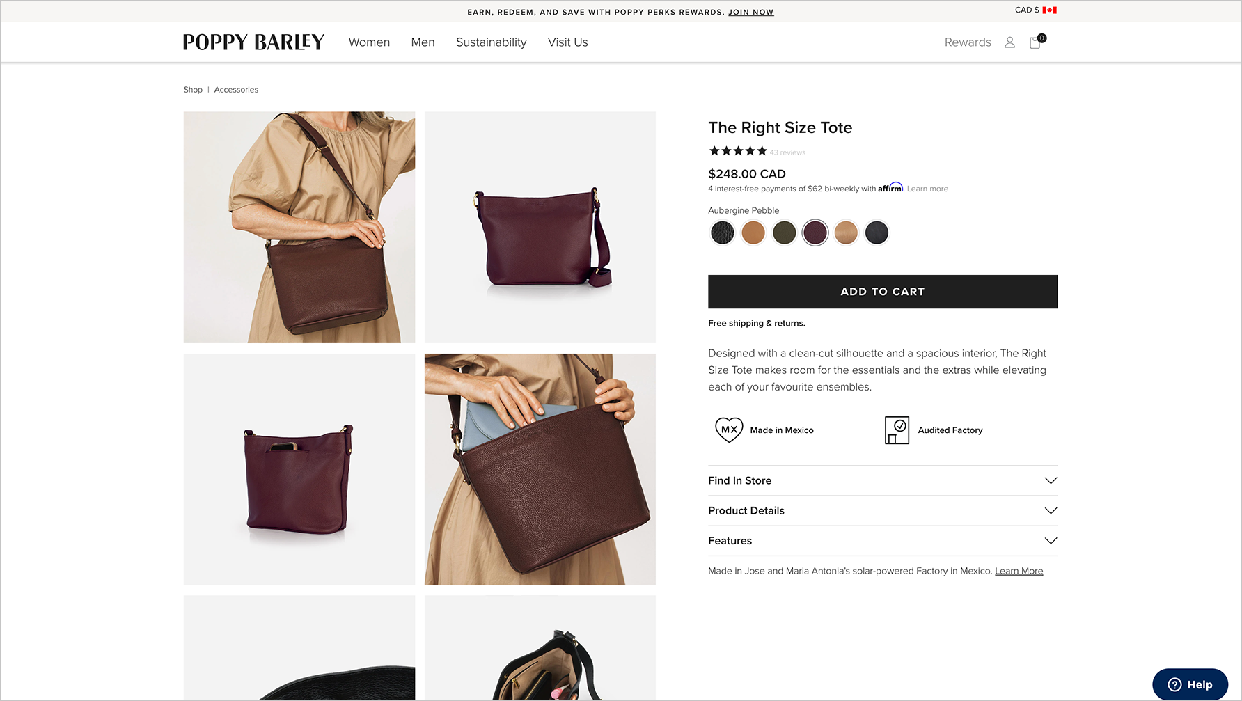
"Poppy Barley" website
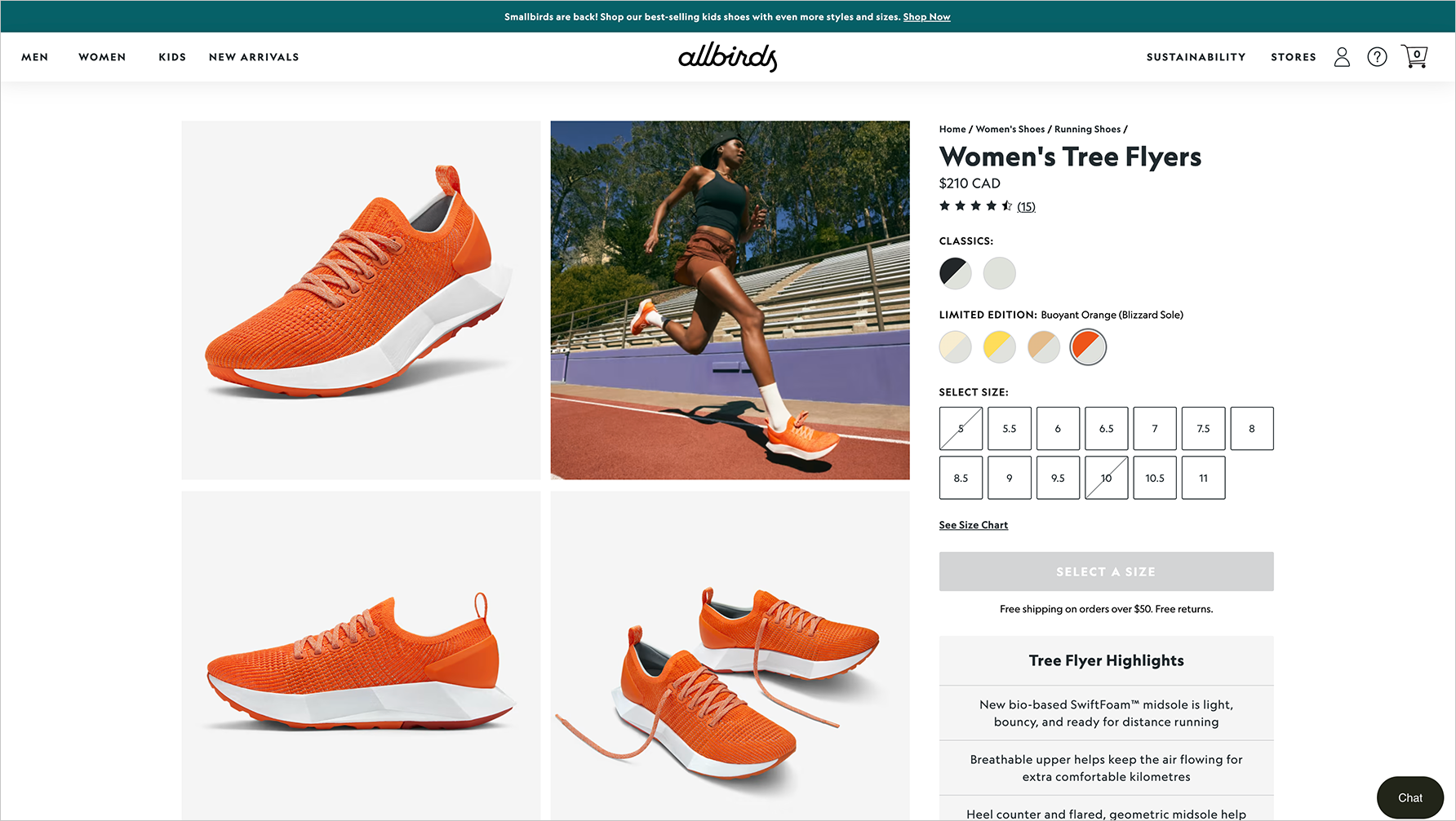
"Allbirds" website
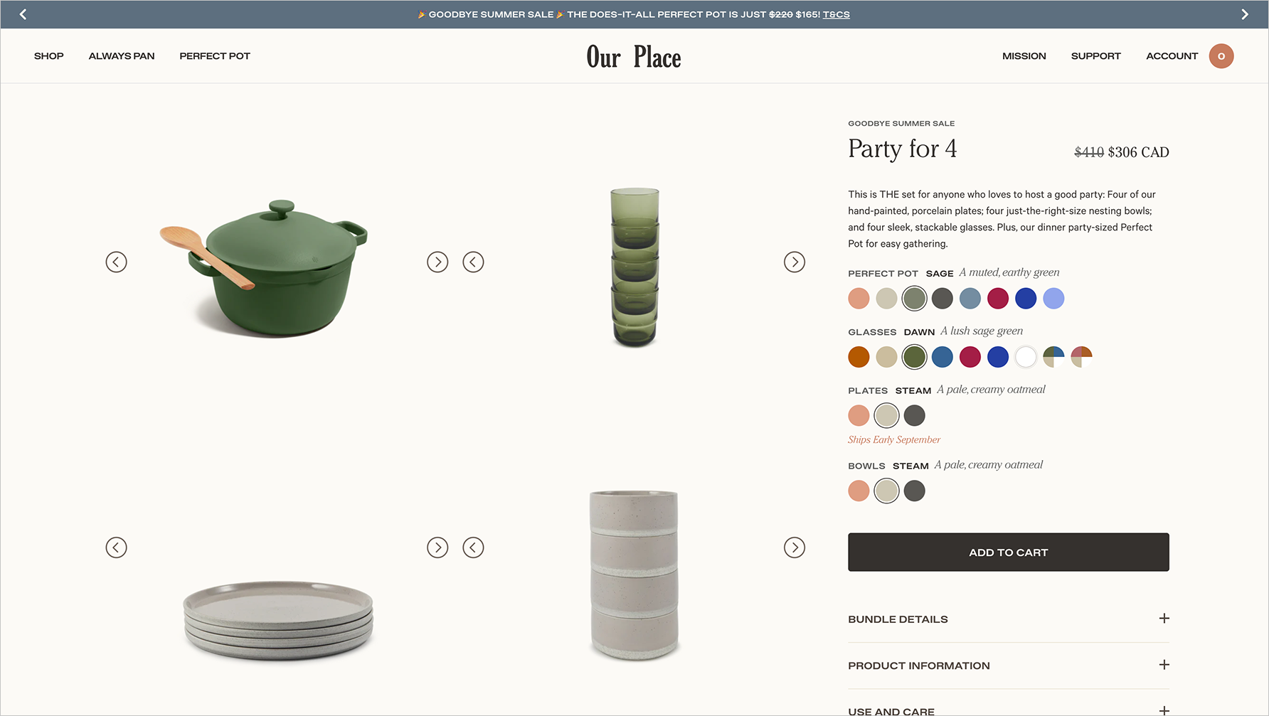
"Our Place" website
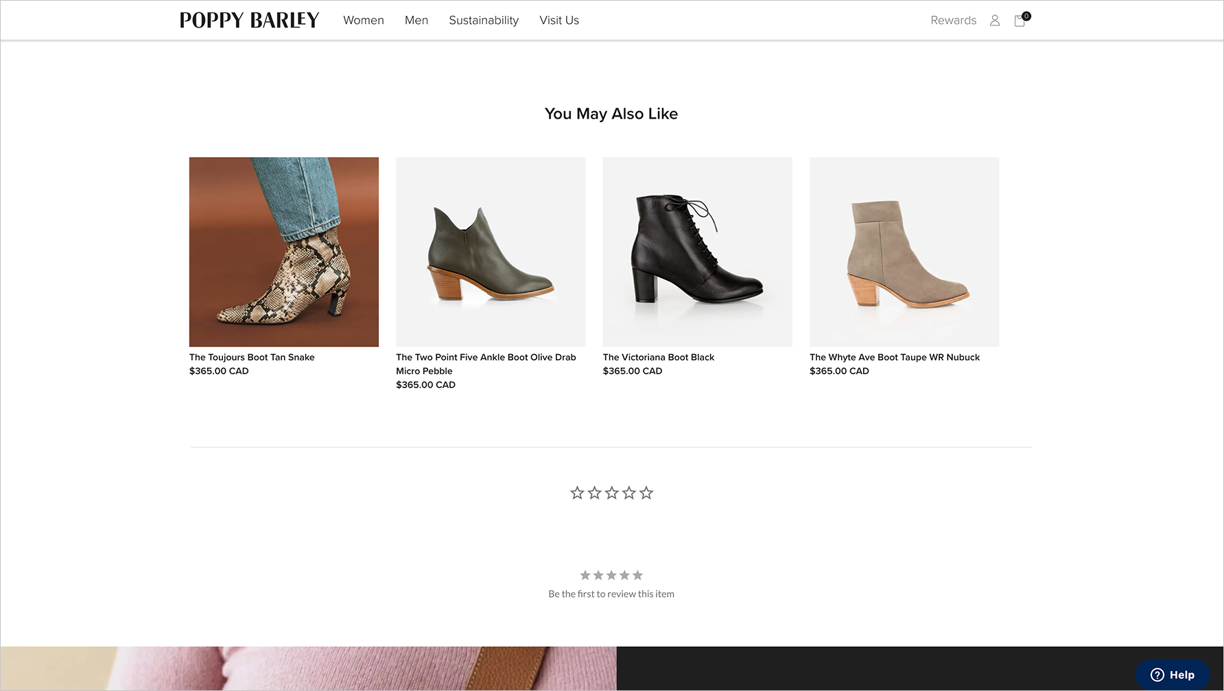
"Poppy Barley" website
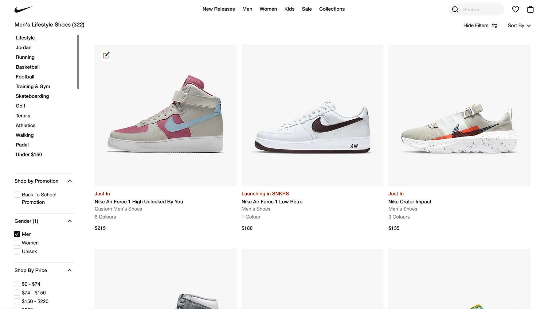
"Nike" website
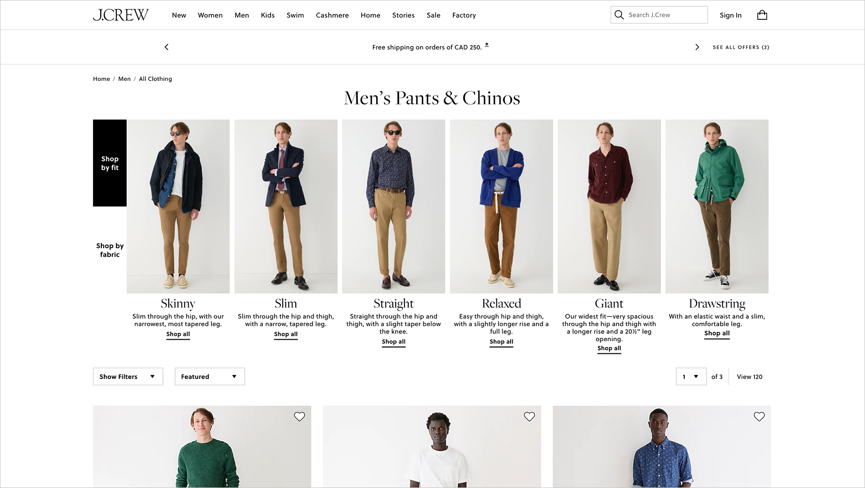
"J.Crew" website

"Organic Basics" website
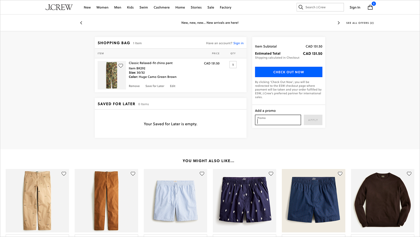
"J.Crew" website
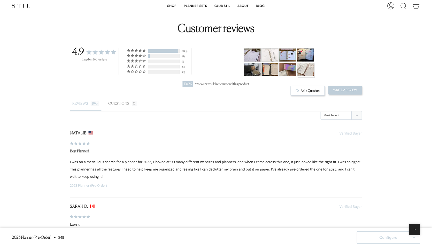
"STIL" website
Design Iterations
With all of the key insights from the research in mind, I started designing from the list of components to create. Variations of each component were presented to the stakeholders for review before moving onto high-fidelity mockups.
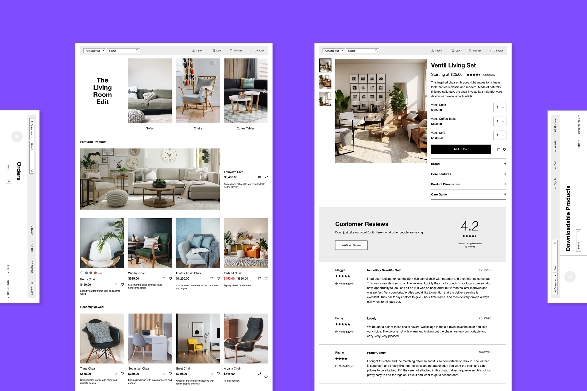
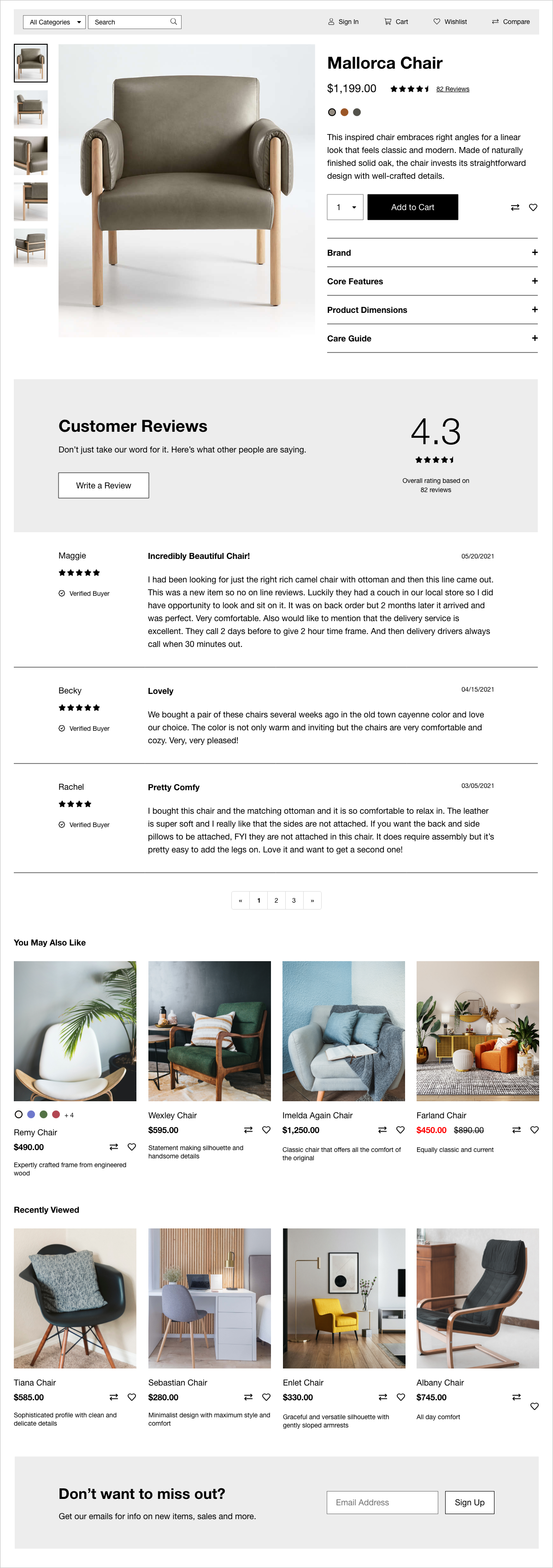
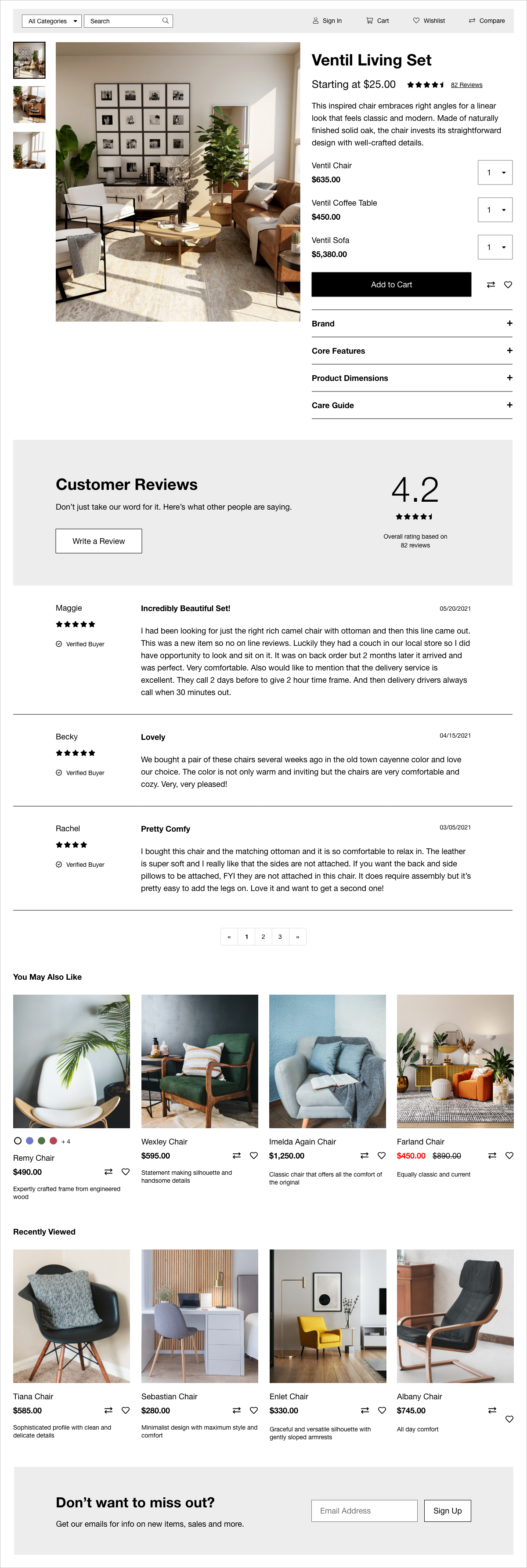
Product Details with Customer Reviews
Based on the key insight that customers have high expectations on usability and performance, I designed a page where the main focus of the page is the carousel of large images that could be flipped through. It’s balanced on the right side with all the necessary details. All the extra details have been hidden in an accordion, but still accessible for the customer.
The customer reviews section follows below. There’s a large summary area with the overall star rating, and a CTA to write a review. All the reviews are there to browse through, with a pagination at the bottom so that not all the reviews are being shown at once.
Variations on the product details page were created so that the site owner could choose a template to show depending on the type of product they’re selling. For example, if a product includes customizations, the owner will be able to select a suitable template. If the owner is selling a service, there’s a template for booking reservations with a specific date and time.
Product details page for a single product
Product details page for a multiple products in a set
Category Page
Based on the key insight that customers are design-savvy people, I created components of what each product looks like on the page. I included all the necessary details such as what colours and sizes are available, the original and sale price, the product name, description, and the ability to “Compare” and “Favourite” the product.
This component was then repeated on a grid to show all the different types of products there are. Category filters were also created to help sort and filter the products so that specific items are easily found.
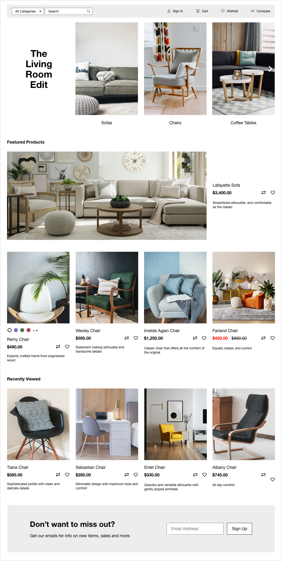
Category page with sub-categories
Category page without sub-categories
Shopping Cart and Check-Out
Instead of the dropdown style of shopping carts that were pervasive in my research, we decided to go for a full page approach so that we could show more details, and have the shopping cart experience be a seamless transition into the check-out process.
Here you’re able to adjust the quantity of the products you’re ordering, and remove them from the cart. On the right, there’s a summary of the subtotal, the shipping and handling cost, taxes, and the estimated total.
For check-out, it’s best practice to break down each step into different screens so that the customer is focused on doing one task at a time. It’s especially important to separate the shipping and billing addresses because they are often different from one another. I also made sure that the “Next” buttons are clear as to what step comes next in the process.
Coupon codes should be added here, and checked to see if the code is still valid, and how much of a discount will occur.
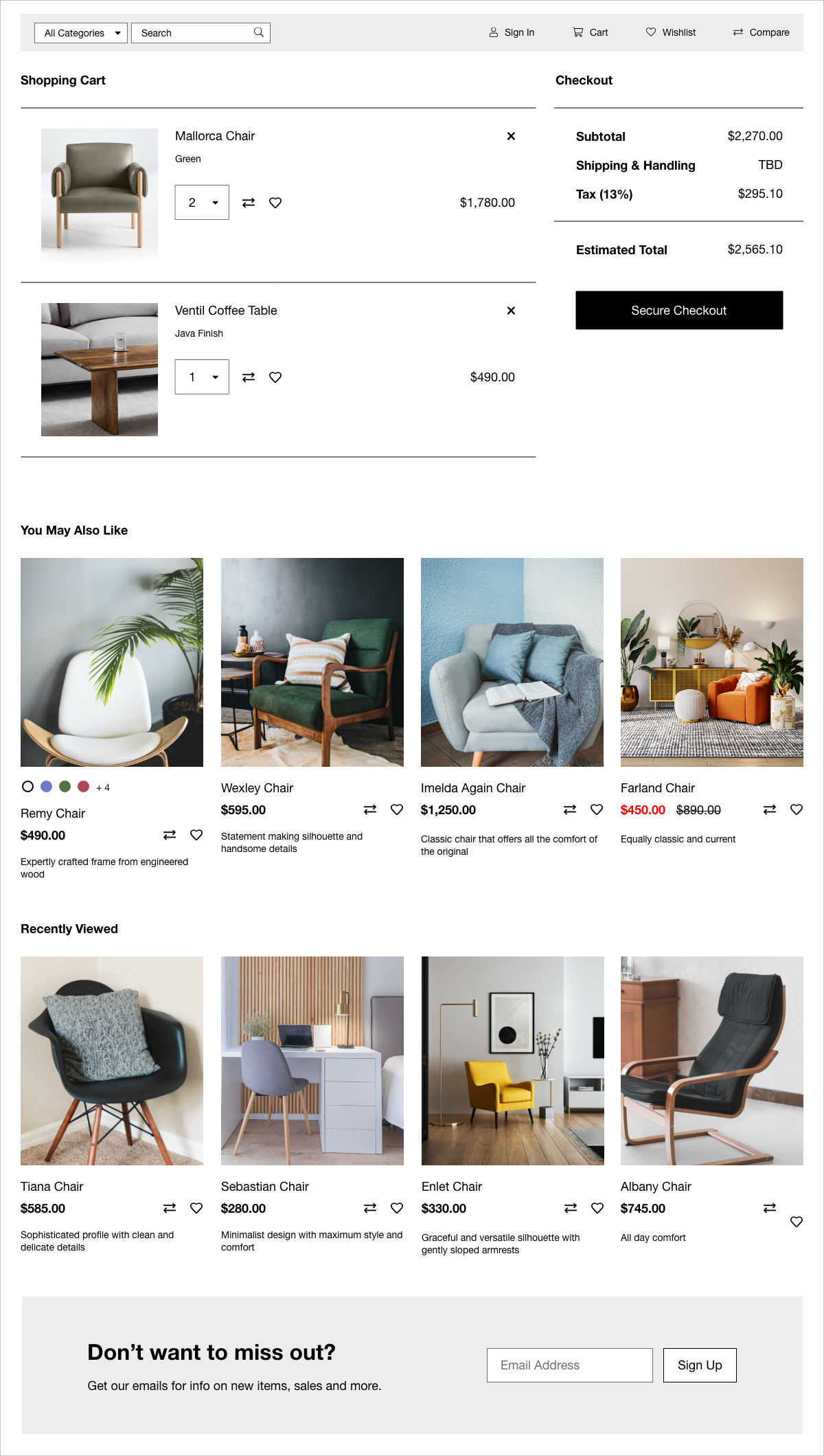
Shopping cart with items in the cart
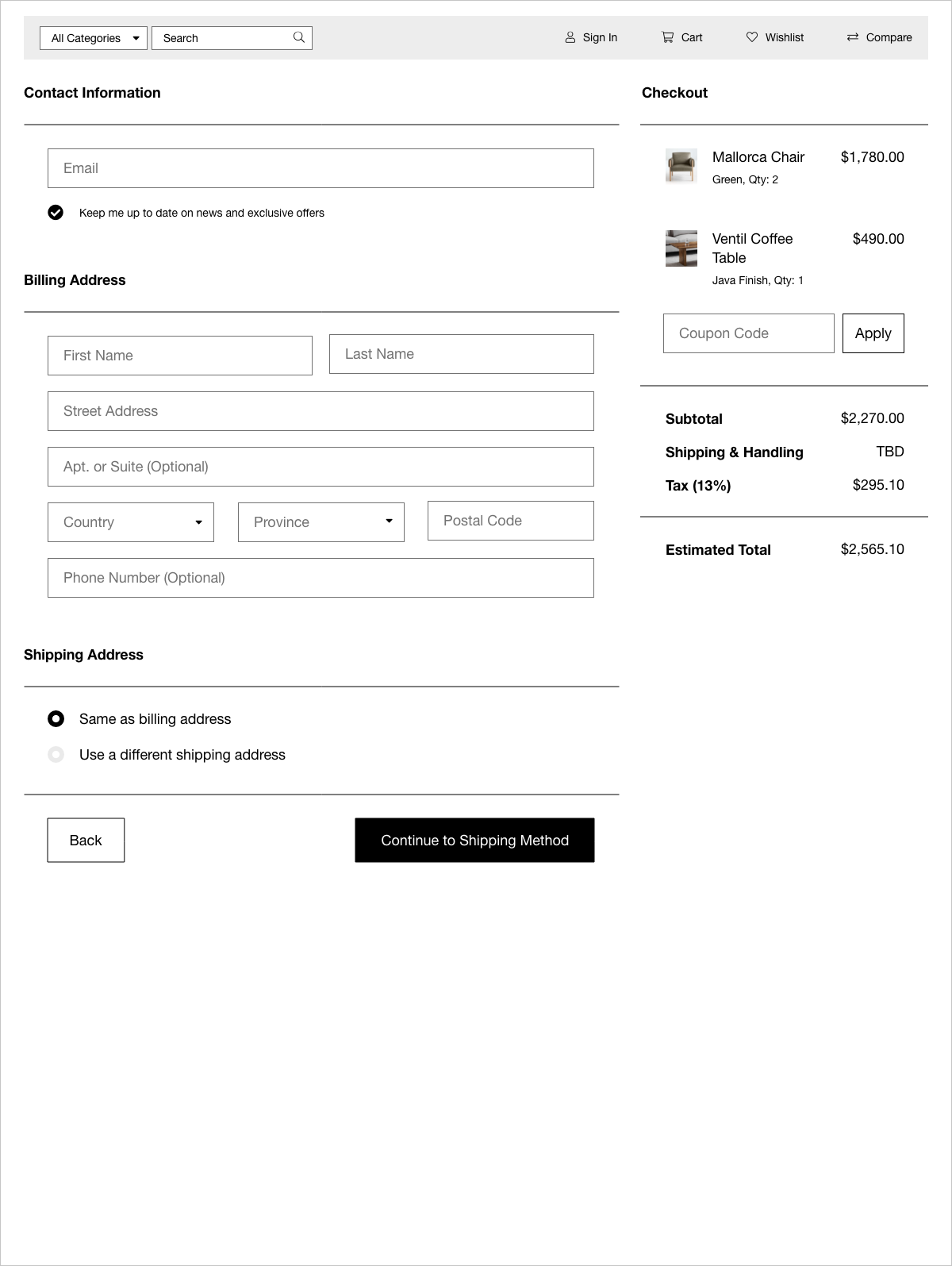
First checkout screen
Customer Login Portal
The open-source e-commerce framework already had existing templates for the customer account creation process and the customer portal, so I was able to decide what to show very easily.
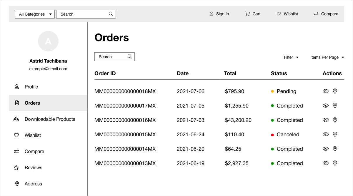
Customer login portal on the "Orders" page
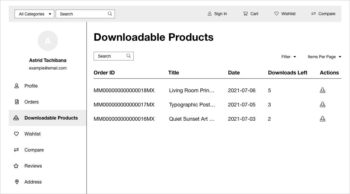
Customer login portal on the "Downloadable Products" page
Results
The overall feedback was quite positive. Product engagement increased as a result of the implementation of an e-commerce platform. More customers were opting to add e-commerce to their websites, start selling products, and make money. Stakeholders were satisfied with advancing the goals of the business to have more e-commerce templates available.
Looking back now, if we weren’t constrained by the limited resources, we could’ve leveraged existing customers and salespeople to do product discovery; use analytics from existing customers to inform our solutions; conduct usability testing with research platforms like UserTesting; and devise experiments to run with the product management team